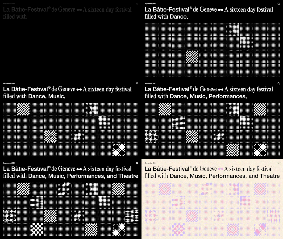
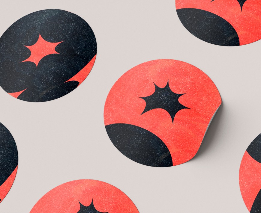
La Bâtie-Festival de Genève
Art Direction and Interaction Design
2021
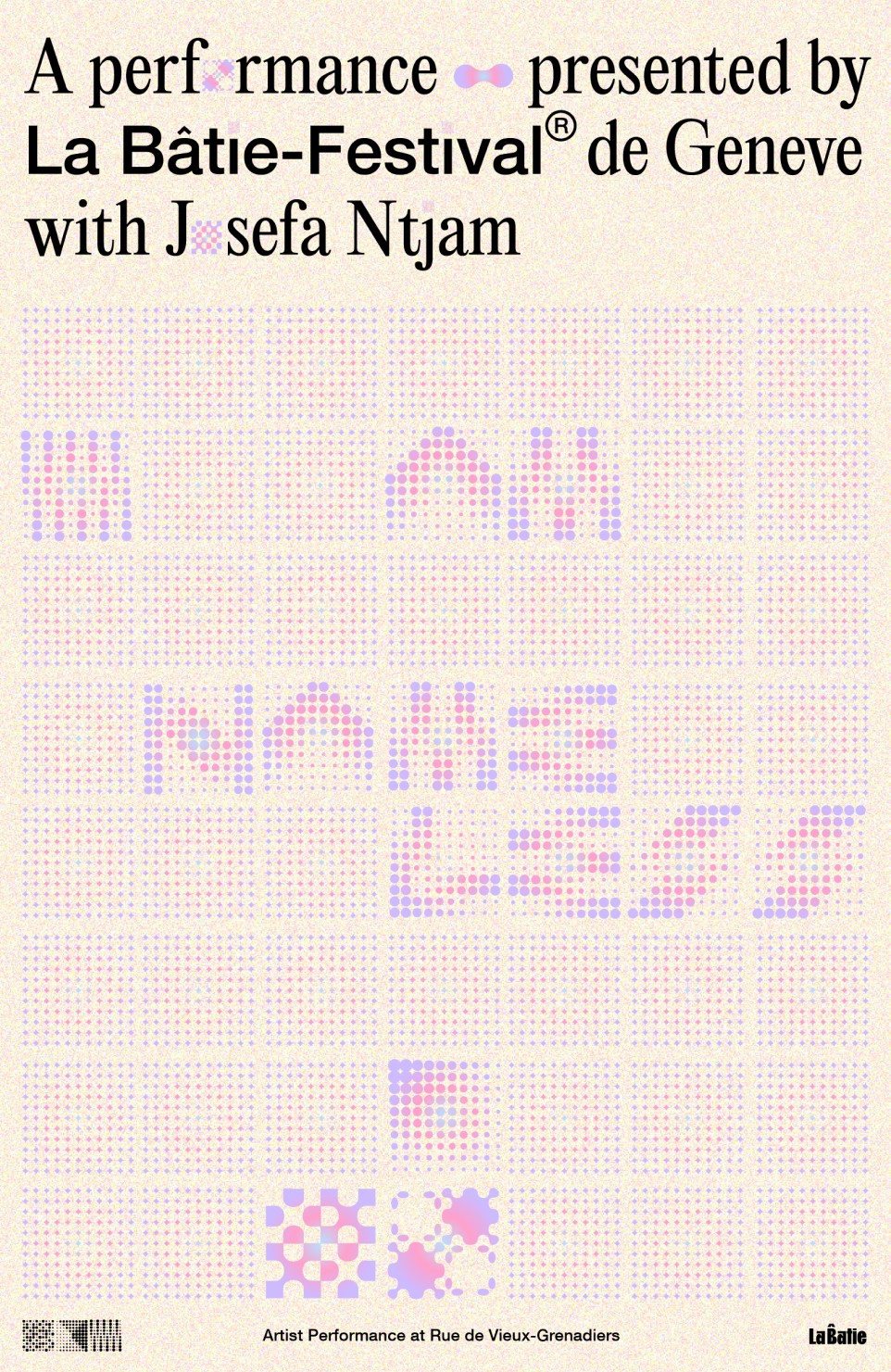
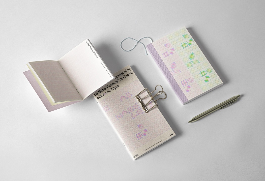
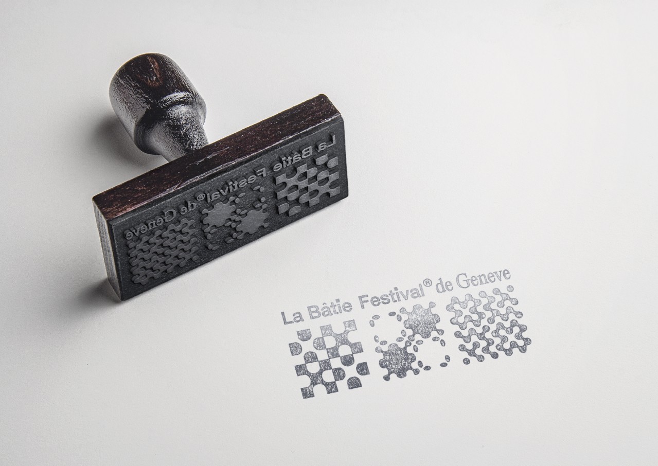
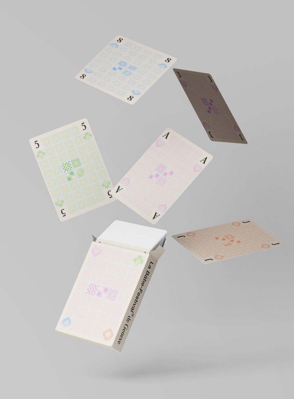
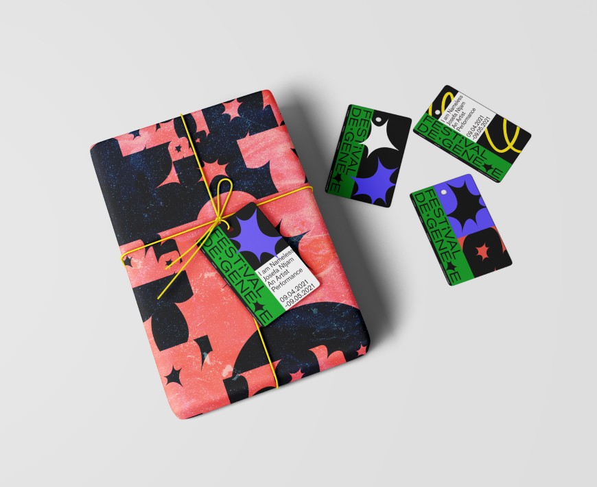
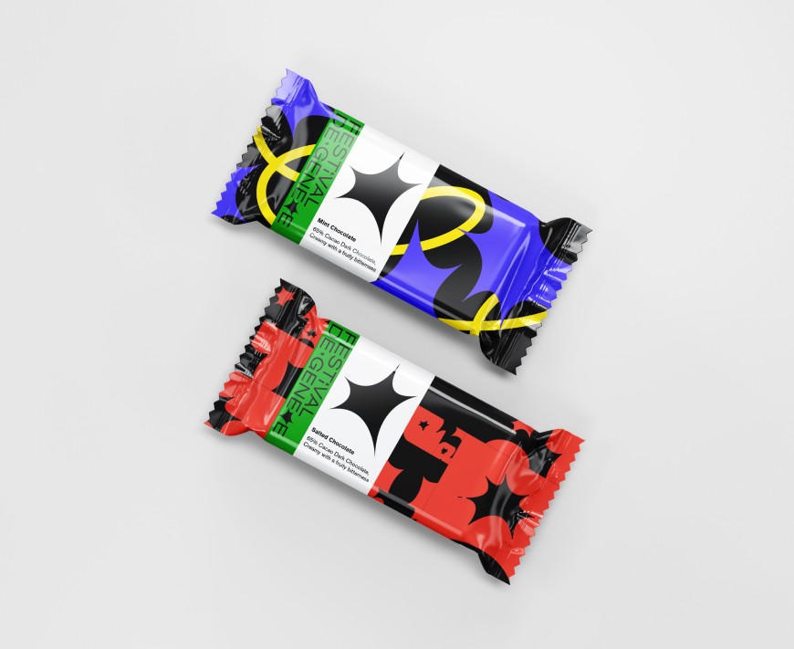
Experimental microsite and brand collateral for La Bâtie.
The Microsite
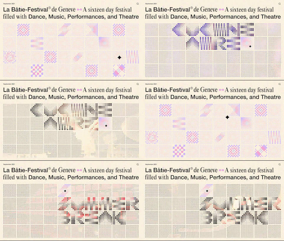
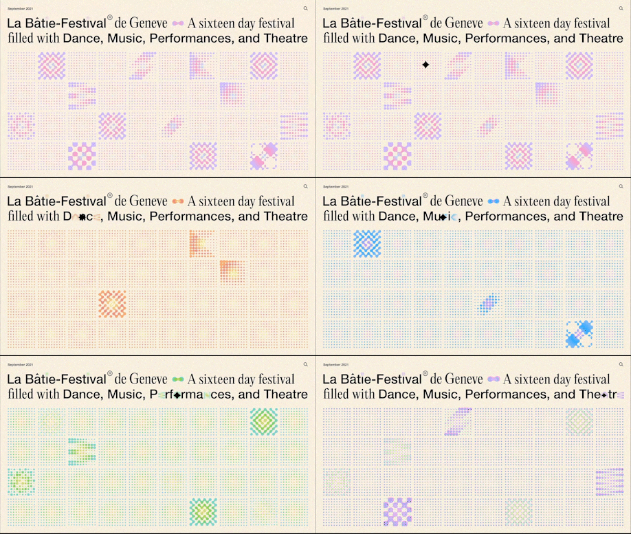
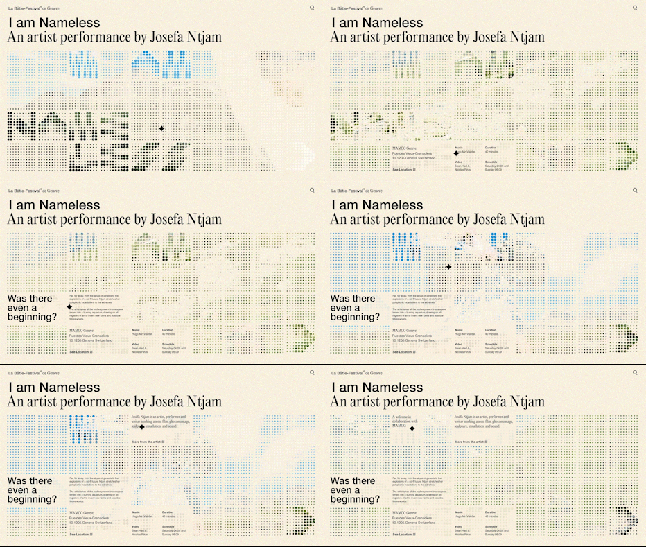
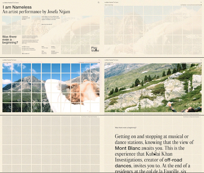
Art Direction Process + Visual Design
Studying a Graphic Precedent
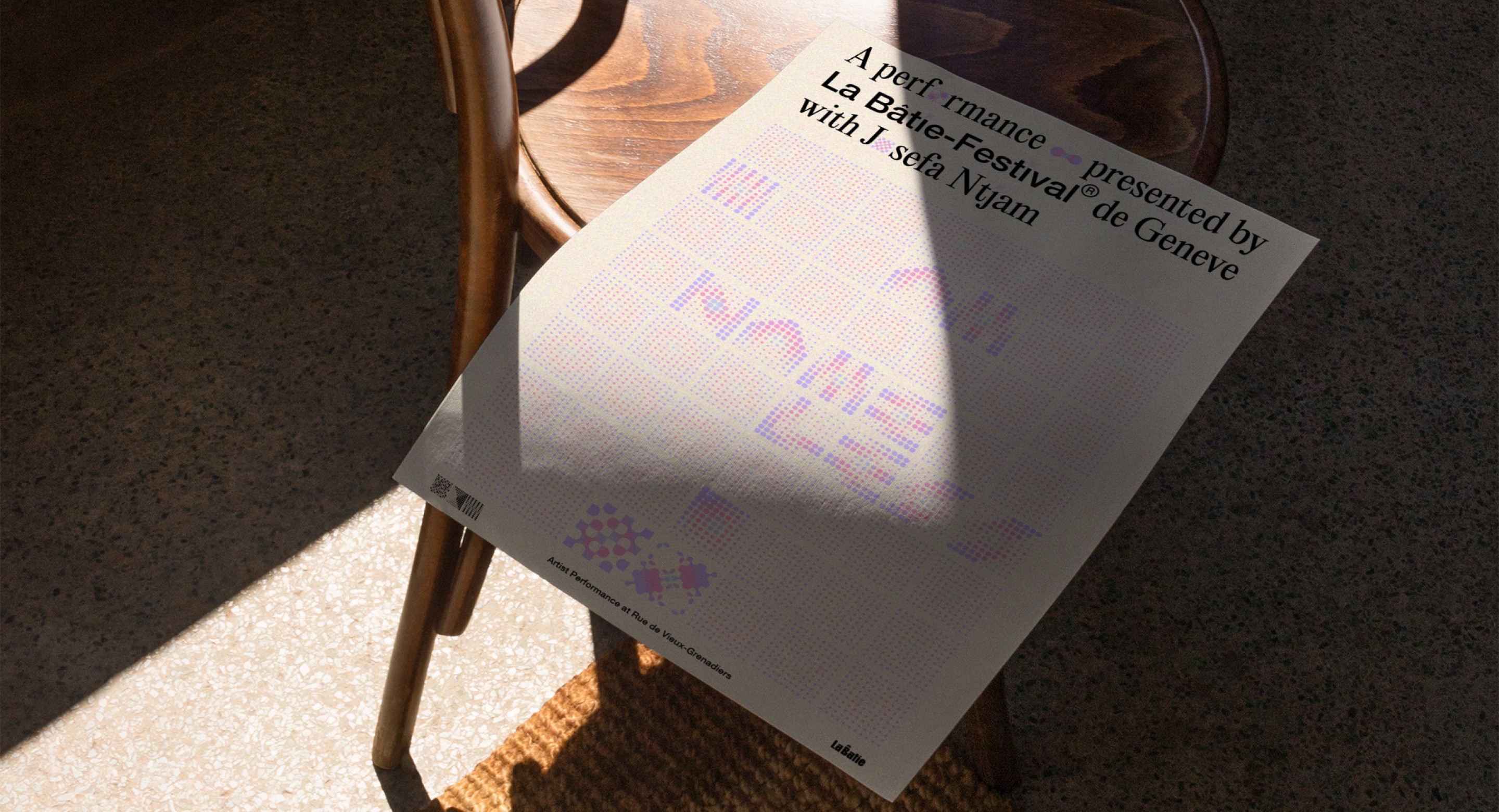
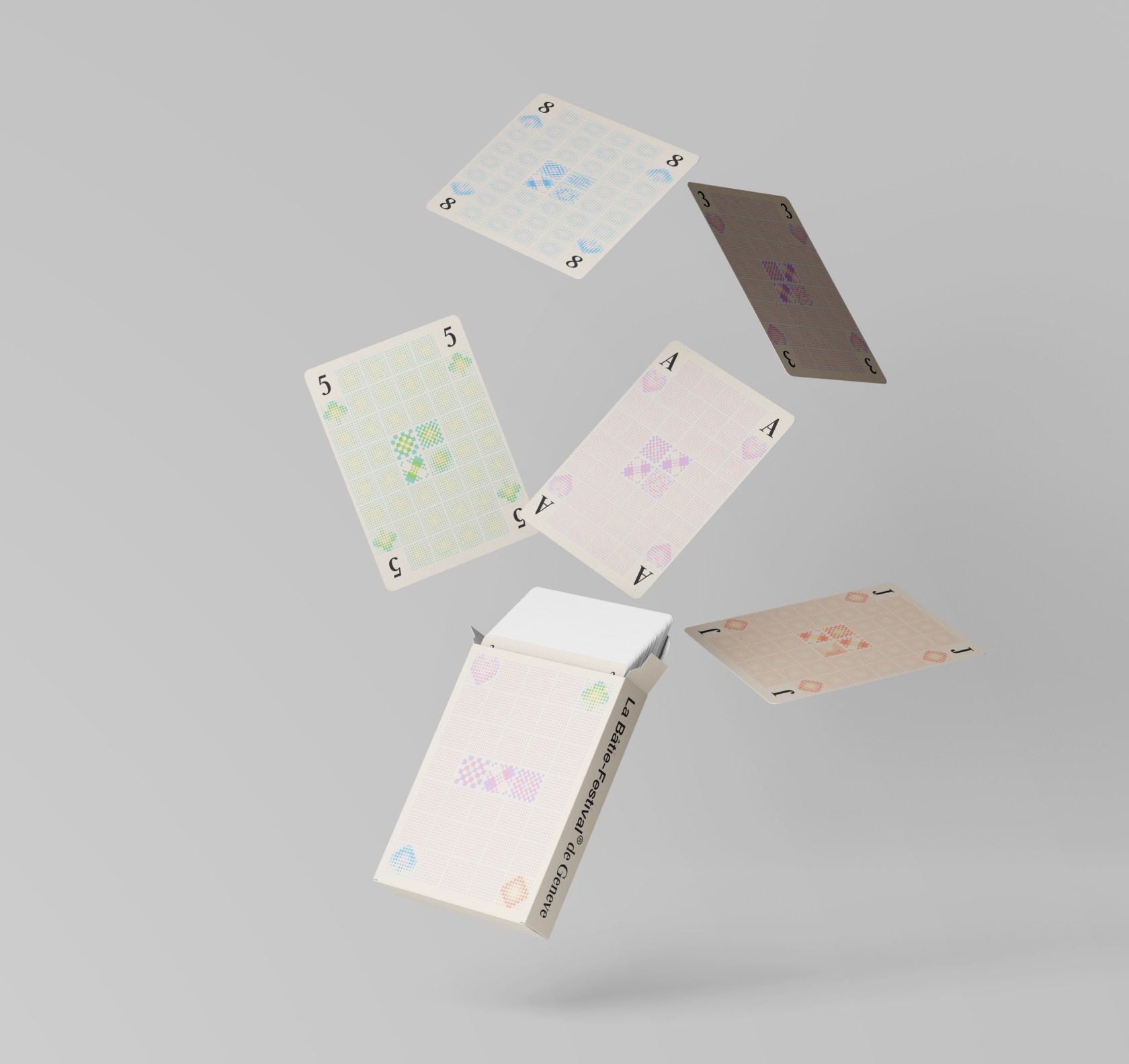
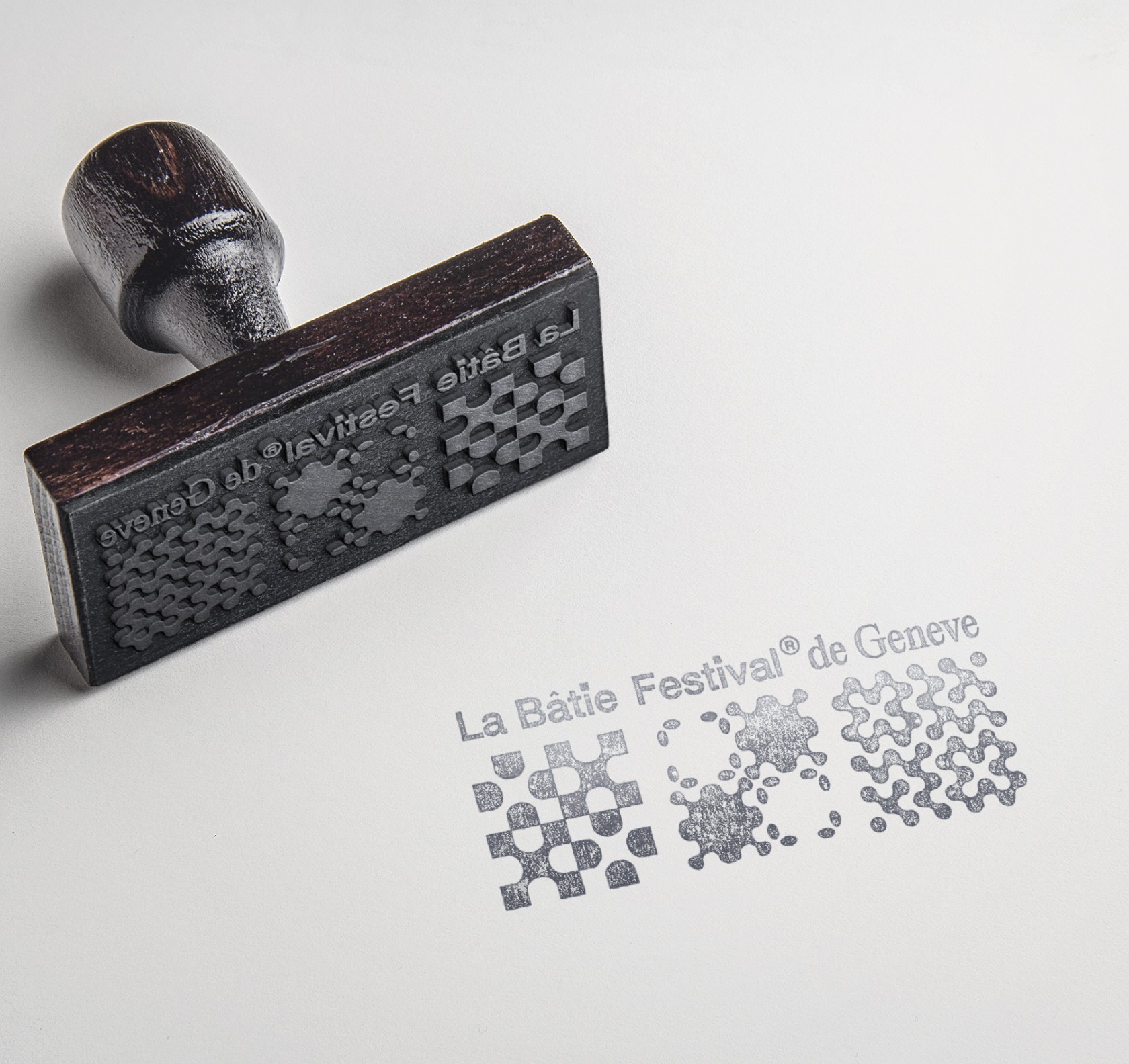
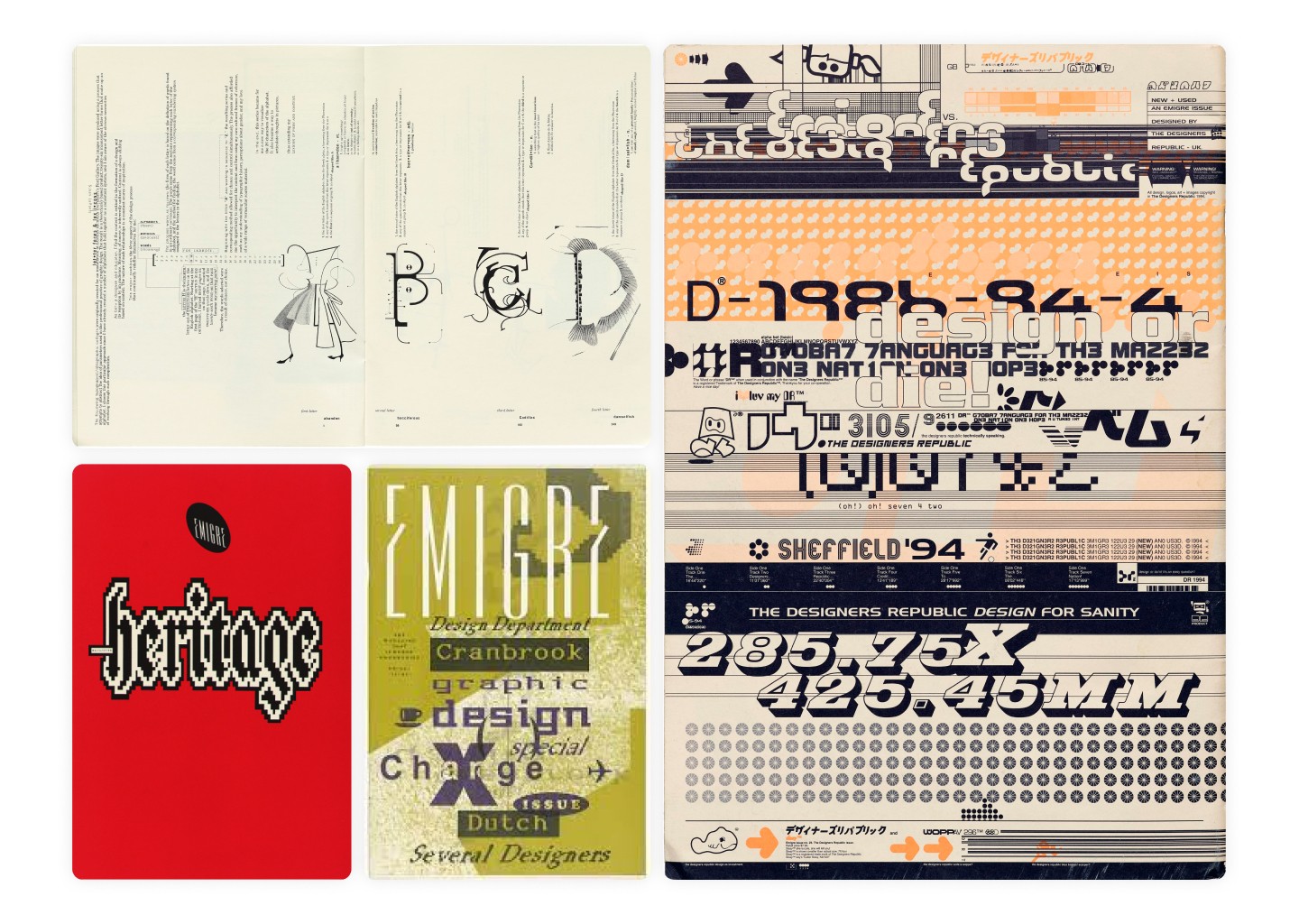
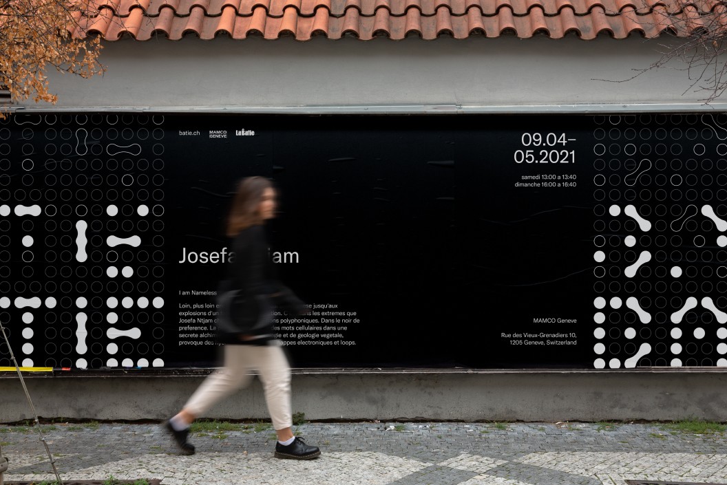
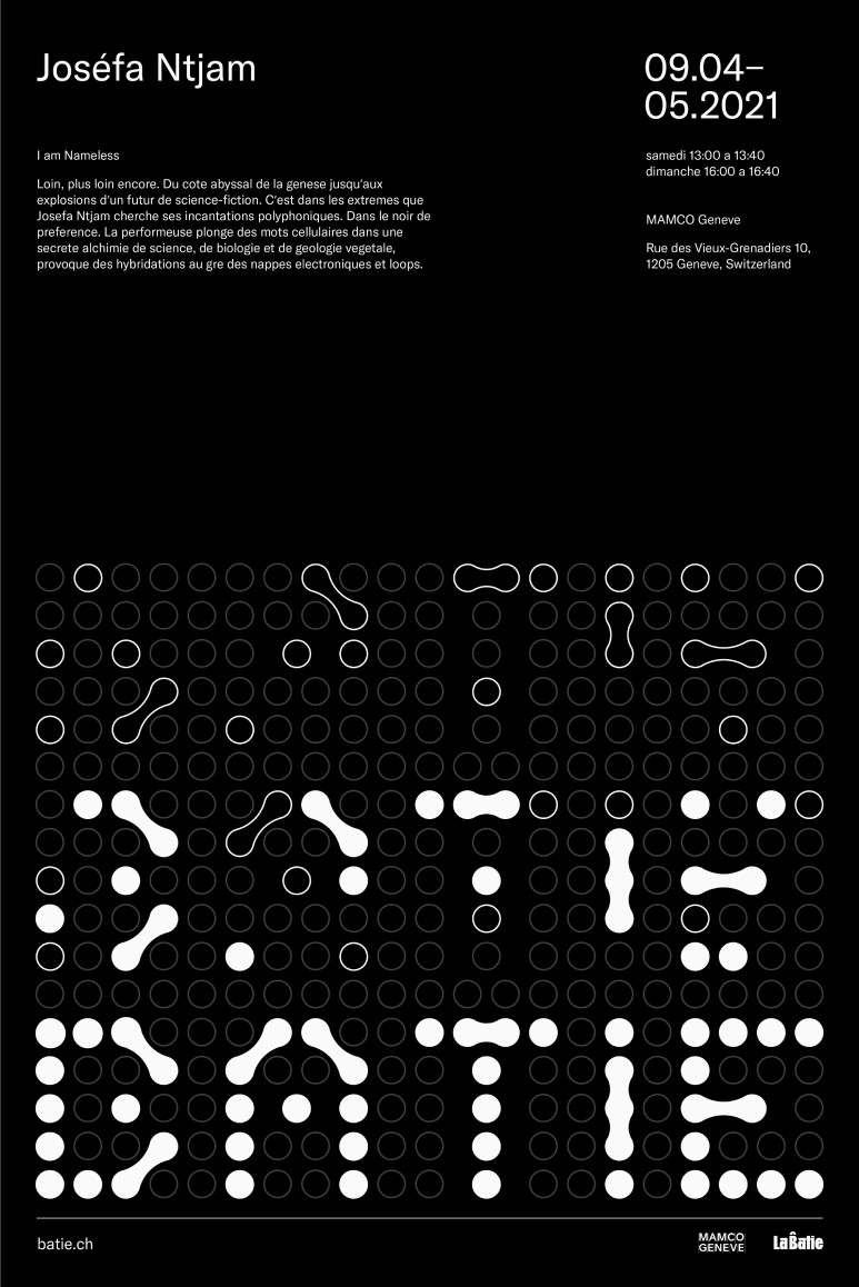
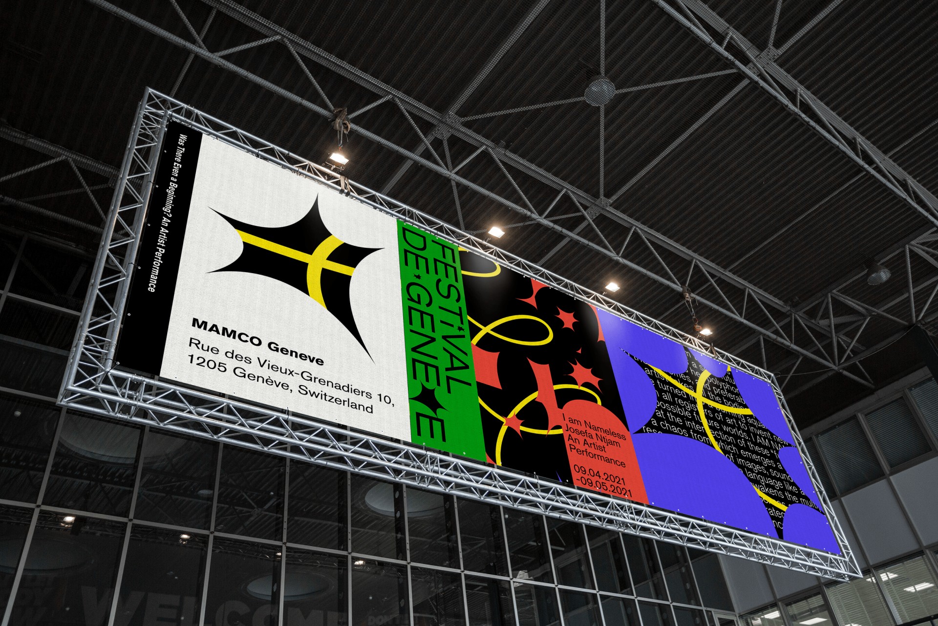
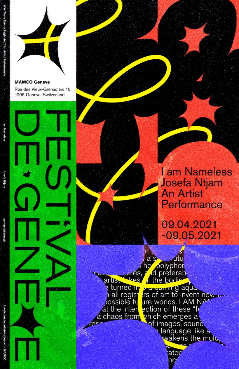
The process started with realizing an art direction by experimenting through poster designs coupled with physical assets. We studied the works of Rudy VanderLans and Zuzana Licko in Emigre Magazine to extract design qualities that we could leverage to lead our art direction and design choices. The duo of Emigre Magazine were very experimental with their use of typography, often resulting in illegible type in their compositions. We were intrigued by this concept and decided to follow the design quality of Using Abstract Forms to Create Type in our visual design.
Work from Emigre Magazine
Visual Design Explorations
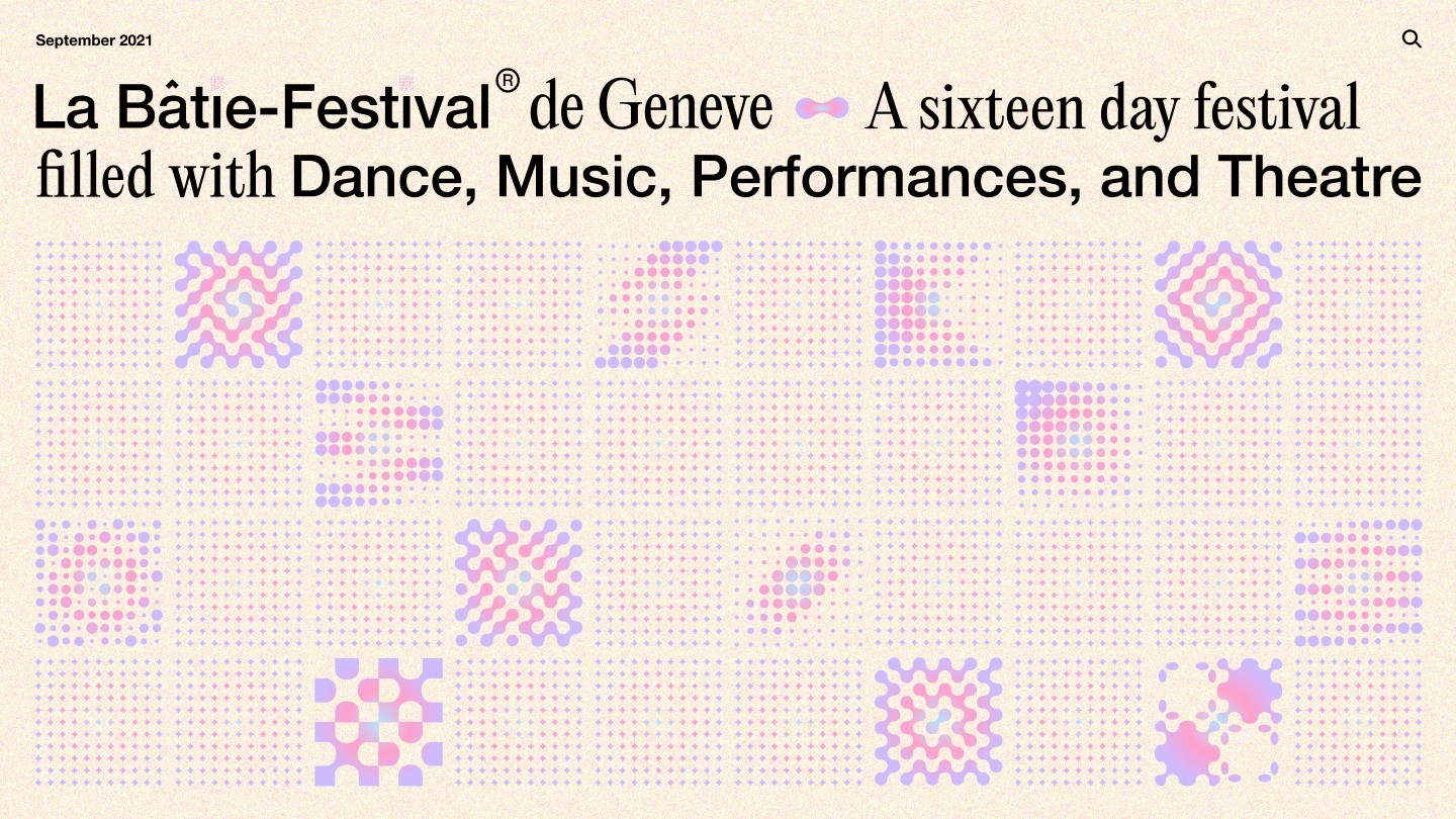
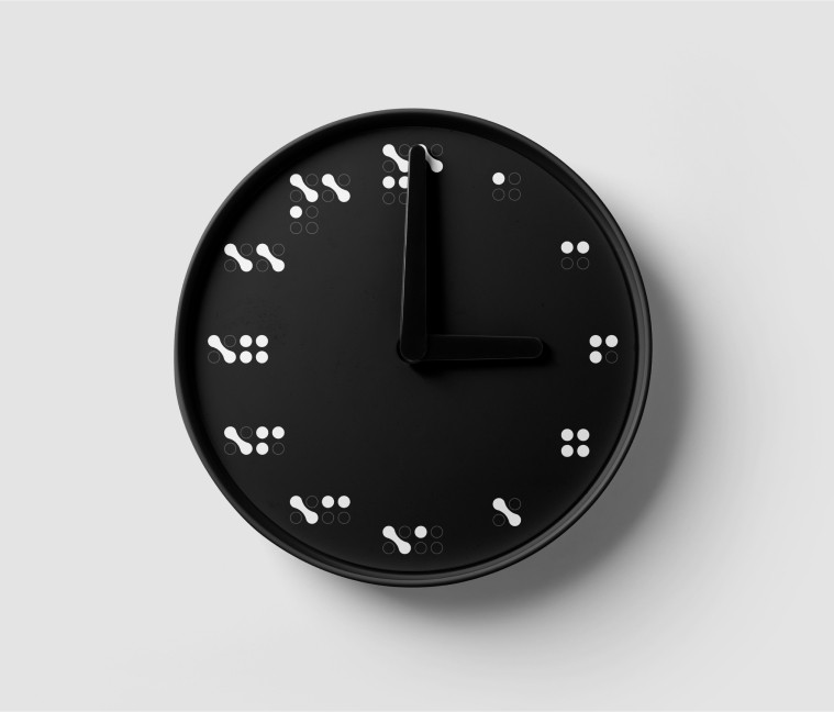
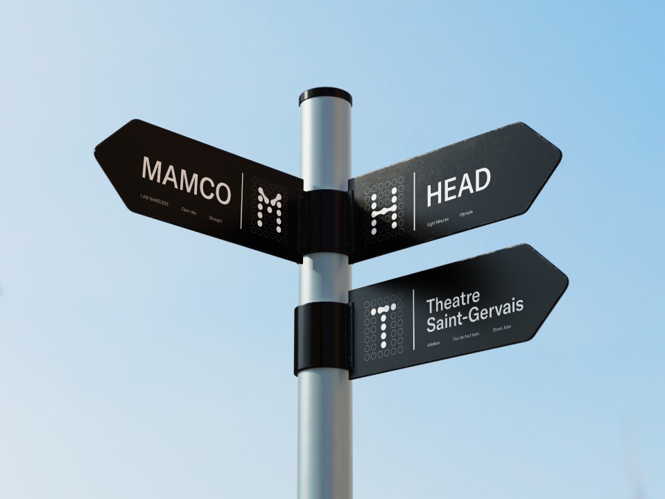
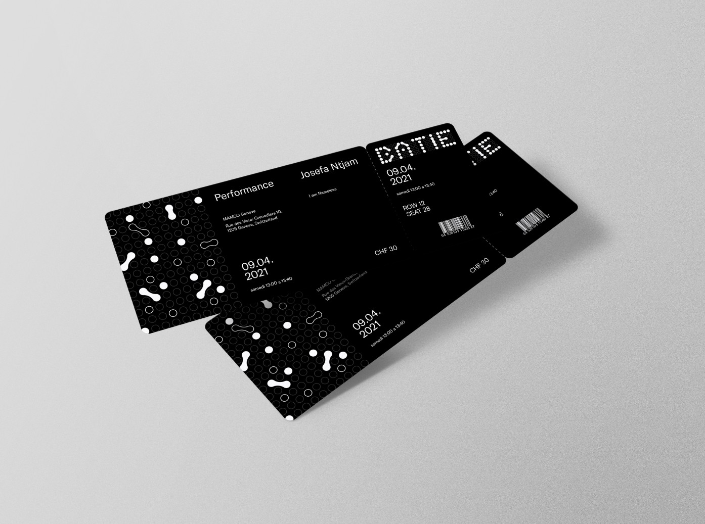
The team explored three different approaches that all employ a custom type by using a modular system of abstract forms. The first approach uses repeating circles of varying sizes in a grid. The second approach also uses circles in a grid, but more emphasis on negative space. The third approach was a more abstract take on a modular type. I spent the most time designing the second approach.
Here are the three approaches in more detail…
Exploration 1
Exploration 2
Exploration 3
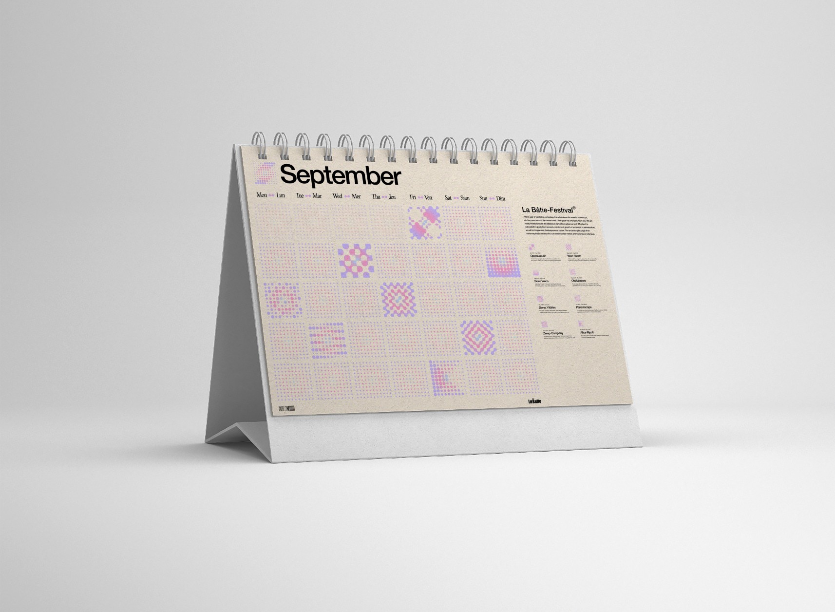
The team moved forward with the first exploration for the microsite because of its strong sense of identity and we felt it would translate the best into the digital medium after analyzing the calendar asset.
Adapting Print to Web
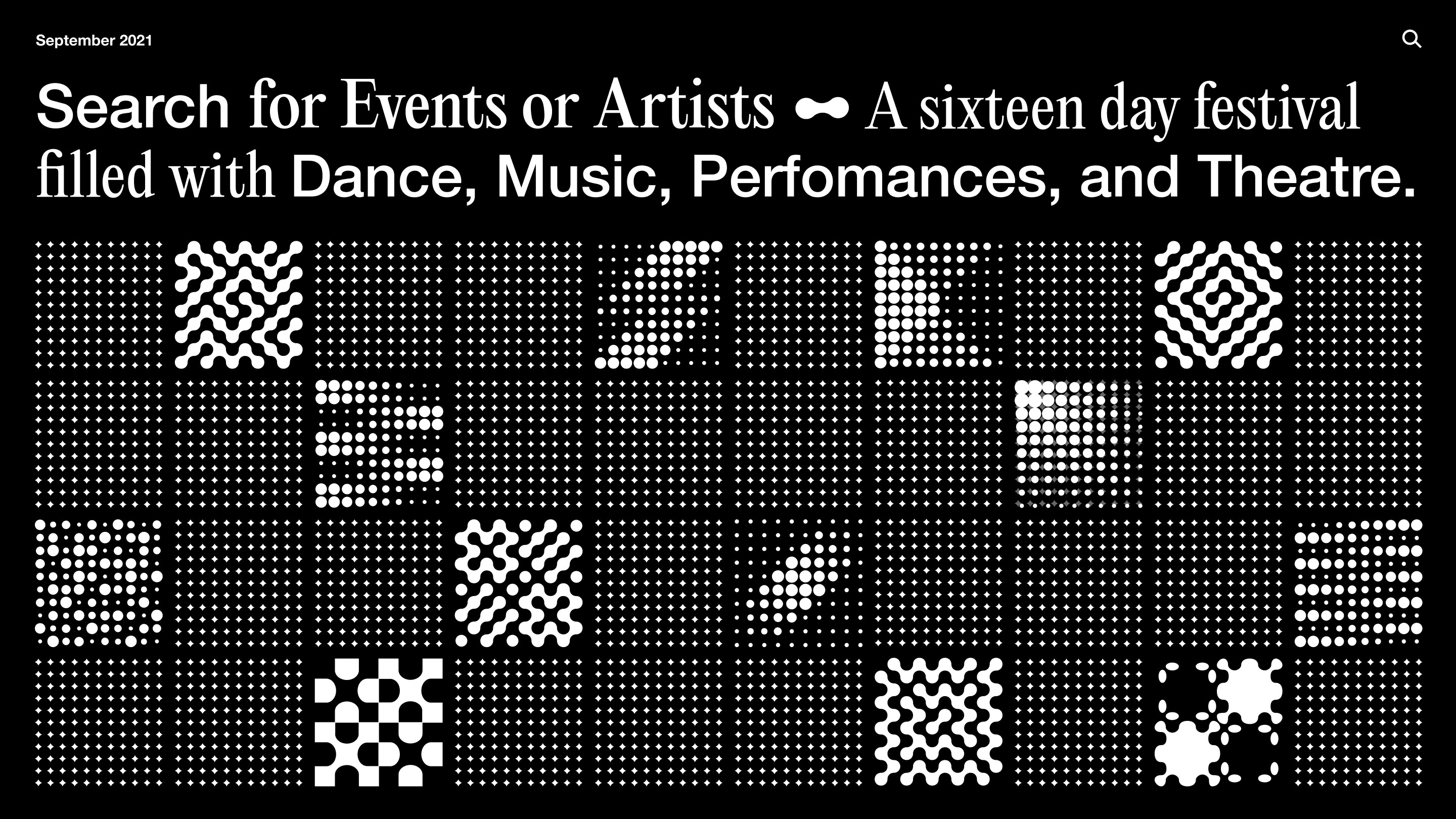
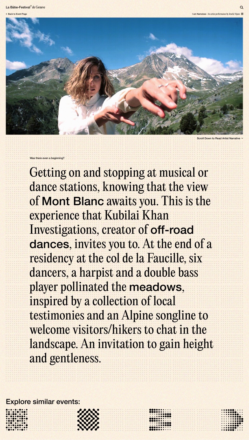
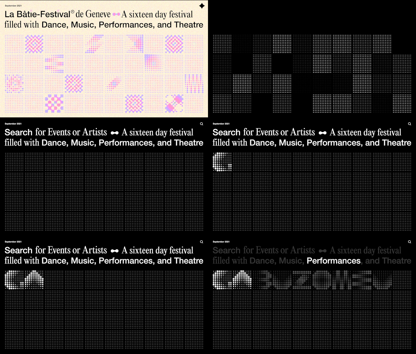
Moving into the microsite and designing interactions, the team felt it was necessary to adjust our design qualities to better fit the digital medium. We changed the quality of Using Abstract Forms to Create Type to Using Abstract Forms to Promote Navigation because we didn’t want to be constrained to using abstract type across the entire experience. Instead, we focused more on the pattern system we had developed as points of interest and as a form of navigating through the site.
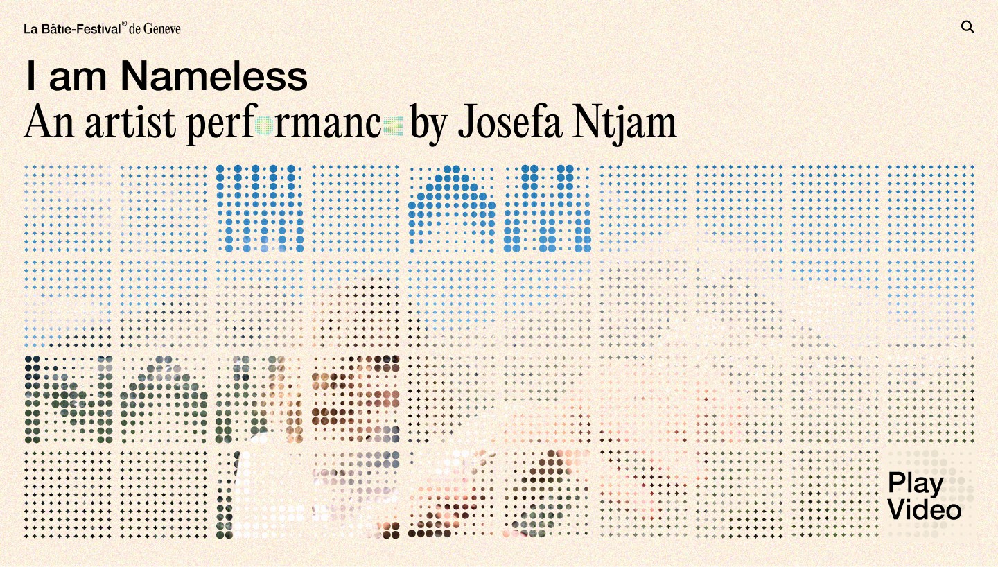
In addition to our pattern system, we wanted to connect our interactions with the concept of ambiguity to magnify satisfaction at the end of the experience. This idea is especially clear in the masking of videos behind the grid of shapes and the reveal on hover of event details.
Key Learnings
Inspiration Is in Everything
During this project, I learned that designers can draw inspiration from a wide range of sources. While analyzing graphic precedents for inspiration, we encountered works that challenged our perceptions and may not have been typically considered "aesthetically pleasing." Nevertheless, we found that there are always design elements that can be reinterpreted and applied in a modern context.
